General Plots
New plots of several different types can be created by using the Plot/General menu item, the Alt-G keystroke from the main application, or the Clone button on an existing plot dialog. These actions will open the general data plotting dialog.

If this dialog has been opened using the Plot/General menu, the plotting area of the new plot will be empty, as shown above. If the Clone button on an existing plot has been used, the new plot will have the same settings and appearance as the plot that was cloned.
Any number of plots may be open at the same time, so that you can easily compare and contrast different data selections or different plot types.
On this dialog, a plot type must first be selected from the drop-down box and then, depending on the plot type, appropriate X, Y, and grouping variables may be selected. Checkboxes allow quantitative variables (those that have floating-point or integer values) to be log10-transformed. After selections are made using the dropdown boxes and checkboxes, a plot will be displayed in the center of the dialog.
The graphic buttons immediately below the plot can be used to zoom and pan the plot, and to save the plot to a file.

When it starts, mapdata will begin evaluating data types and compiling statistics for every column in the data source. This information is needed to ensure that only appropriate types of columns can be selected for the X and Y axes of the plot. If this process has not completed before the Plot/General menu option is selected, a notice will be displayed indicating that evalution of data types is still ongoing. When this evaluation is complete, the notice will disappear and the plot dialog will appear.
After the plot is generated, the Source Data and Plot Data buttons at the bottom of the dialog will open a tabular display of the data used for the plot. The Clone button opens another plot dialog with the same selections as the current one, so that it is easy to compare similar plots.
All of the types of plots that can be created from the Plot/General menu are described and illustrated in the following subsections.
Box plot

The box plot, or box-and-whisker plot, displays the distribution(s) of a single variable, for one or more categories. The central box shows the range of values encompassing the second and third quartiles (the inter-quartile range, or IQR), the colored bar in the middle of the box is the median, the whiskers that extend beyond the box show the data range exclusive of outliers, and any points (dots) beyond the whiskers represent outliers. Points are identified as outliers if they are more than 1.5 times the IQR above the third quartile or below the first quartile. The number of outliers shown on a box plot is also shown in the Bivariate statistics dialog.
Creation of a boxplot requires specification of a quantitative X variable. If a grouping variable is also specified, a separate box plot will be displayed for each unique value of the grouping variable.
By default, box plots are oriented vertically. They can be rotated horizontally with the Alt-R keystroke.
Other types of plots that can be used to visualize data distributions are histograms, stripcharts, kernel density plots, and violin plots.
Breaks groups

The Jenks Natural Breaks algorithm is a deterministic method of clustering one-dimensional data (i.e., values of a single quantitative variable) into two or more groups. Clusters are defined by sets of contiguous samples for which the average deviation of each sample from the mean of the group is less than the deviation from the means of other groups. Clusters, or groups, of values for a single variable may arise because of the presence of outliers, because the data are derived from a mixture of distributions, and for other reasons. The method does not assume or require that the data conform to any statistical distribution. Logarithmically-transformed data may have a different number of breaks than the un-transformed data.
Mapdata allows the groups defined by the Jenks Natural Breaks algorithm to be viewed in several different ways. The ‘Breaks groups’ plot shows the different groups on the X axis, and the values within each group on the Y axis. Creation of a ‘Breaks groups’ plot requires specification of a single quantitative variable, as the X variable. The result shows a scatter plot of the data divided into two or more groups. The number of groups shown is the optimum in the range from 2 to 8. The method of determining the optimum number of groups can be visualized with a ‘Breaks optimum’ plot.
At least two groups will always be identified and shown on a ‘Breaks groups’ plot. If only two groups are shown, the user must decide whether subdivision of the data into at least two groups is warranted. The ‘Breaks optimum’ plot and other plots that show data divided into Natural Breaks groups can assist with this determination.
Other types of plots that can show groups defined by Jenks Natural Breaks are Normal Q-Q plots, scatter plots, and line plots.
Breaks optimum

The Jenks Natural Breaks method does not itself identify how many clusters, or groups, are present within a data set. Mapdata uses a simple heuristic to estimate the optimum number of breaks in a data set. This heuristic is based on the goodness of variance fit (GVF). The GVF is 1.0 minus the ratio between the sum of squared deviations from the group means divided by the sum of squared differences from the overall mean, expressed as a percentage. The GVF increases with the number of groups, reaching 100 when the number of groups equals the number of data points.
The heuristic used by mapdata is to select the number of groups where there is the largest relative change in slope in a plot of GVF versus the number of groups. The plot produced shows the GVF values for each number of groups, with a dot superimposed on the curve at the point where there is the greatest relative change in slope. Such an inflection point is commonly referred to as the ‘knee of the curve’.
Creation of a ‘Breaks optimum’ plot requires specification of a single quantitative variable, as the X variable–just as for the ‘Breaks groups’ plot.
Because it is not possible to find a change in slope when there is just one group, the minimum number of groups that can be identified by this heuristic is two. Thus, even a data set with a smooth continuous distribution will be assessed as having two groups. When only two groups are identified, the user should use the ‘Breaks optimum’ plot and other plots that separate data by Jenks Natural Breaks groups, to decide whether this heuristic produces a reasonable result. Other statistical methods not supported by mapdata may also be useful for this purpose.
Bubble plot

This plot type shows the relationships between three numeric variables, and optionally, a fourth categorical variable. The relationship between two of the numeric variables, X and Y, are shown as a scatter plot. The third numeric variable, Z, is represented by the size of the symbol on the plot. The area of each symbol is proportional to the value of the Z variable. The maximum symbol size can be adjusted using the “Max. size” setting on the plot dialog.
If a grouping variable is also specified, then each symbol will be colored according to the value of the grouping variable.
Symbols will be partially transparent by default. The transparency (alpha value) can be adjusted with the Alt-A keystroke. The Y axis can be flipped with the Alt-F keystroke.
Count by category

This plot type shows the number of rows in the data table for each unique value of a categorical variable. This data summary is shown as a bar chart, with the category values on the X axis and the counts on the Y axis. Category values are ordered alphabetically on the X axis.
The same category counts are shown on a Pareto chart plot, ordered by decreasing frequency of the categorical variable values.
Missing values are not shown on this plot. The number of missing values for each variable can be viewed using the Table/Data types menu option.
Production of this plot requires specification of only a single categorical variable (as X).
The axes of this plot can be rotated with the Alt-R keystroke. The Y axis can be flipped with the Alt-Y kestroke when the axes are rotated–that is, when the categories are listed on the Y axis.
CV by category

This option produces a bar chart showing the coefficient of variation (CV) of a numeric variable for each value of a categorical, or grouping, variable. To produce this plot, the numeric variable must be specified as X. Bars are vertically oriented by default.
Any group that does not have at least two observations will not be shown in the chart, but the data for this group can be seen using the “Source Data” and “Plot Data” buttons.
The orientation of the chart can be rotated with the Alt-R keystroke. The Y axis can be flipped with the Alt-F keystroke when the plot is rotated–that is, the categories are shown on the Y axis.
Date range by category

This plot shows the date range, as defined by the values in two different date or timestamp columns, for each category value of a categorical variable. Dates are shown on the X axis and categories are listed on the Y axis. The first and last dates are connected by a solid line.
To produce this plot, the two date variable columns and the categorical variable column must be specified. If there are not two date (or timestamp) columns in the data set, this plot type will not be shown in the list of available plot types.
Data rows with any missing data will not be included. When there are multiple data rows for each category, the earliest ‘first date’ value and the latest ‘last date’ value will be used for the plot.
Categories will be ordered from top to bottom (on the Y axis) by the first date values, similar to the typical display of a Gantt chart. If any of the values in the ‘last date’ column are actually earlier than the corresponding value in the ‘first date’ column, then a warning message will be displayed, and the order of categories will be incorrect.
The Min-max by category plot can be used to show date ranges for a single variable instead of for two variables.
The order of values on the Y axis can be flipped with the Alt-F keystroke.
Empirical CDF

The empirical cumulative distribution function (CDF) plot shows the cumulative frequency, on the Y axis, of the values of a quantitative variable, on the X axis. The left end of the function is at 0,0, and the right end has a Y value of 1.0 at the maximum X value. Each point on the curve identifies the fraction of all data points that are less than the corresponding X value.
The empirical CDF function is commonly convex upward for distributions with a central mode. There is no requirement, or assumption, that the data follow any particular statistical distribution (hence, “empirical”). For data that do conform to a statistical distribution (such as the Gaussian distribution or Normal distribution), the curve will be smooth. Irregularity in the curve may indicate the presence of a mixture distribution.
Creation of an empirical CDF plot requires specification of a single quantitative variable as X.
Histogram

The histogram shows the number of data points (on the Y axis) within certain ranges of values of a quantitataive variable (on the X axis).
Creation of a histogram requires specification of a single quantitative variable (as X). By default, the range of X values is subdivided into a number of bins determined by Doane’s rule (Doane 1976). The number of bins can be changed using the Alt-B keystroke. (The number of bins selected also affects Min-max by bin plots.)
A grouping variable may also be specified. If it is, stacked bars will be created, with each value of the grouping variable colored differently.
Other types of plots that can be used to visualise distributions of a variable for different categories are box plots, stripcharts, kernel density plots, and violin plots.
Kernel density (KD) plot

A kernel density (KD) plot shows a smoothed representation of the probability density of a quantitative variable. The smoothing method does not assume, or require, that the data conform to any statistical distribution. The smooth representation of the data density may, however, help to reveal whether a particular statistical distribution might apply.
This plot type produces a KD plot of a single quantitative variable, which is specified as the X variable.
If a grouping variable is also specified, each category corresponding to a different value of the grouping variable is shown in a different color, and the plots for individual categories are partially transparent so that areas of overlaps can be distinguished. The opacity (alpha value) can be changed using the Alt-A keystroke. The area under the curve for each category is proportional to the number of observations in that category. Consequently, the KD plot represents the relative sizes of all the categorical subsets, as well as their distributions.
Other types of plots that can be used to visualise distributions of a variable for different categories are box plots, stripcharts, histograms, and violin plots.
Line plot


This plot shows the relationship between two quantitative variables, X and Y. Successive data points, ordered by the X variable, are connected by a line. Creation of this plot requires, at a minimum, specification of quantitative X and Y variables. Date and date/time values can be used as the X variable. A grouping variable may also be specified; if it is used, a separate line, uniquely colored, will be produced for each value of the grouping variable. Data for which the X value, the Y value, or the grouping value are missing will not be included in the plot.
In addition to grouping points based on columns of categorical data in the data table, points can be grouped by Jenks Natural Breaks of the X variable, if the X variable is quantitative (not a date or date/time). This grouping option is listed as “* Breaks in X”. Vertical lines delineating Jenks Natural Breaks in the X value can be toggled on and off with Alt-B.

In addition, if the X variable is numeric (not a date or date/time), a least-squares linear regression line can be fitted to the data and displayed on the plot; this can be toggled on and off with Alt-R. The fitted regression is shown as an orange line. A dialog box showing the regression slope, intercept, and R-squared value can be displayed when the regression is calculated; display of this dialog box can be turned on or off using the Plot/Configure menu item or a configuration file setting. Regression statistics can also be seen by using the Stats/Bivariate menu item.
Further, if the X variable is numeric, a local polynomial regression (LOESS) line can be fitted to the data points and displayed on the plot. Fitting and display of the LOESS line can be toggled on and off with Alt-L. The LOESS line is displayed as a black line. With large data sets, there may be a perceptible delay while LOESS fitting is done.
Also, if the X variable is numeric, a Theil-Sen line can be displayed. The Theil-Sen slope is calculated and drawn through the median X and Y values. The Theil-Sen line is shown in green.
The opacity (alpha value) of the plotted data lines can be adjusted using the Alt-A keystroke. This may be useful when a grouping variable is used and there are multiple categories, or when greater emphasis is to be given to the regression or LOESS lines.
Lorenz curve
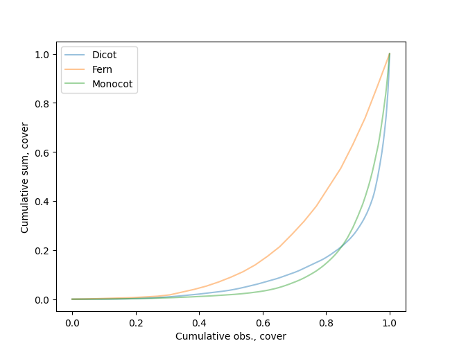
This plot of a single numeric variable shows the cumulative number of observations on the X axis and the cumulative sum of observations, after ordering from least to greatest, on the Y axis. The minimum Y value is subtracted from all Y values before calculation, so the origin of the curve is always at the 0,0 point.
An equal distribution of values across all observations will form a diagonal line from lower left to upper right. More unequal distributions will deviate farther from this line.
The plot is not produced if there is only one data point or if the maximum data value is zero.
Mean by category

This option produces a bar chart showing the mean, or average, of a numeric variable for each value of a categorical, or grouping, variable. To produce this plot, the numeric variable must be specified as X. Bars are vertically oriented by default.
The orientation of the chart can be rotated with the Alt-R keystroke. The Y axis can be flipped with the Alt-F keystroke when the plot is rotated–that is, the categories are shown on the Y axis.
Min-max by bin

This plot shows the largest and smallest, or first and last, values of a numeric variable, on the X axis by default, for distinct ranges (bins) of another numeric variable (on the Y axis by default). The minimum and maximum values are connected by a solid line.
This type of plot is related to a boxplot or categorical stripchart, but:
emphasizes only the minimum and maximum values of the X variable,
allows alternate binning of the Y variable, instead of using fixed categories, and
by default is rotated 90 degrees.
The number of bins used for the Y variable can be changed with the Alt-B keystroke. The number of bins selected is also used for histogram plots.
The X and Y axes of the plot can be reversed with the Alt-R keystroke, and the order of values on the Y axis can be flipped with the Alt-F keystroke.
Min-max by category

This plot shows the largest and smallest, or first and last, values of a quantitative variable, on the X axis by default, for each unique value of a categorical variable on the Y axis (by default). The minimum and maximum values are connected by a solid line.
This type of plot is related to a boxplot or categorical stripchart, but emphasizes only the minimum and maximum values of the quantitative X variable and by default is rotated 90 degrees.
Both date and date/time variables can be used on the X axis, and date variables can be used on the Y axis. This type of plot is therefore better suited than some others for showing temporal limits or ranges.
The Date range by category plot can be used to show date ranges as specified by two variables instead of just one variable.
The X and Y axes of the plot can be reversed with the Alt-R keystroke, and the order of values on the Y axis can be flipped with the Alt-F keystroke.
Normal Q-Q plot

The Normal quantile-quantile, or Q-Q, plot plots the actual quantiles of a quantitative variable against the theoretical quantiles if the data followed a Normal (Gaussian) distribution. Each data point is shown as a separate symbol (a circle). The plot includes a 1:1 line that represents the relationship that is expected if the data set is indeed Normally distributed.
Creation of a Q-Q plot requires only the specification of a quantitative X variable.
Deviations of the plotted points from the 1:1 line indicate deviations from Normality. These deviations may be because the data set is not Normally distributed, contains outliers, or consists of a mixture distribution. Subgroups of samples that are defined by Jenks Natural Breaks can be seen–colored differently–by using the Alt-G keystroke.
Pareto chart

The Pareto chart shows the frequencies of different values of a categorical variable as a bar chart, with values ordered from most to least frequent. The cumulative percentage of all values is also shown, as a line overlain on the frequency bars.
The same frequencies are shown by the Count by category plot, ordered by values of the categorical variable.
Missing values are not shown on this plot. The number of missing values for each variable can be viewed using the Table/Data types menu option.
Production of this plot requires specification of only a single categorical variable (as X).
Scatter plot

The scatter plot shows the relationship between two quantitative variables (X and Y). Each data point is represented by a symbol (a circle).
A grouping variable may also be specified; if it is used, a separate set of dots, uniquely colored, will be displayed for each value of the grouping variable. Data for which the X value, the Y value, or the grouping value are missing will not be included in the plot. In addition to grouping points based on columns of categorical data in the data table, points can be grouped by Jenks Natural Breaks. These grouping options are listed as “* Breaks in X” and “* Breaks in Y”.
Dots on the scatter plot will be partially transparent by default. The opacity (alpha value) can be changed using Alt-A.
A least-squares linear regression line can also be displayed on the plot; this can be toggled on and off with Alt-R. The regression line is shown as an orange line. A dialog box showing the regression slope, intercept, and R-square can be displayed when the regression is calculated; display of this dialog box can be turned on or off using the Plot/Configure menu item or a configuration file setting. The Stats/Bivariate menu option can also be used to display a similar scatter plot with additional regression details and other bivariate statistics.
In addition, a local polynomial regression (LOESS) line can be fitted to the data points and displayed on the plot; this can be toggled on and off with Alt-L. The LOESS line is shown as a black line.
Also, if the X variable is numeric, a Theil-Sen line can be displayed. This line can be toggled on and off with the Alt-S keystroke. The Theil-Sen slope is calculated and drawn through the median X and Y values. The Theil-Sen line is shown in green.
Lines delineating Jenks Natural Breaks can be toggled on and off with Alt-B (at least one line, or two groups, will always be shown; the user must decide if these are reasonable).
The Y axis can be flipped with the Alt-F keystroke.
Stripchart

This option displays the distribution of a single quantitative variable as a jittered stripchart. A symbol (a circle) is shown at each value of the quantitative variable. The variable’s range of values is shown on the Y axis by default. To help visualize data density when there are many identical or similar values, each data point is jittered slightly on the X axis (by default) to spread them out and reduce overplotting. In addition, symbols are partially transparent so that overplotted symbols are darker than isolated single symbols. The opacity (alpha value) can be changed using the Alt-A keystroke.
If a grouping variable is also specified, a separate stripchart is displayed for each unique value of the grouping variable.
The orientation of the chart can be rotated with the Alt-R keystroke.
Other types of plots that can be used to visualise distributions of a variable for different categories are box plots, histograms, kernel density plots, and violin plots.
Total by category

This option produces a bar chart showing the total, or sum, of a numeric variable for each value of a categorical, or grouping, variable. To produce this plot, the numeric variable must be specified as X. Bars are vertically oriented by default.
The orientation of the chart can be rotated with the Alt-R keystroke. The Y axis can be flipped with the Alt-F keystroke when the plot is rotated–that is, the categories are shown on the Y axis.
Violin plot

The violin plot shows the distribution of a quantitative variable as a symmetrical smoothed density distribution throughout the range of the data. A single quantitative variable must be specified. On the vertical (by default) central axis of the violin plot is a small box-and-whisker plot.
If a grouping variable is also specified, a separate violin plot will be displayed for each unique value of the grouping variable.
The orientation of the chart can be rotated with the Alt-R keystroke.
Other types of plots that can be used to visualise distributions of a variable for different categories are box plots, stripcharts, kernel density plots, and histograms.
Y range plot

This plot shows the minimum and maximum values of one quantitative variable, on the Y axis, over a range of different values of another quantitative variable on the X axis. The area between minimum and maximum Y values, for a range of contiguous X values, is filled with a solid color.
Creating a Y-range plot requires specification of quantitative variables for both X and Y axes, Dates and date/time variables can be used in addition to numerical variables.
The order of values on the Y axis can be flipped with the Alt-F keystroke.
Zipf’s Law plot
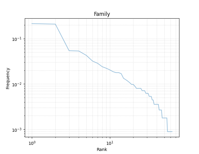
This plot shows the frequency distribution of a single categorical variable, and whether that distribution conforms to Zipf’s Law. The frequency of each unique value of the variable is shown on the Y axis, and the rank (1 is highest, or most frequent) is shown on the X axis. Both axes are log scaled.
Creating a Zipf’s Law plot requires only specification of a single categorical variable.